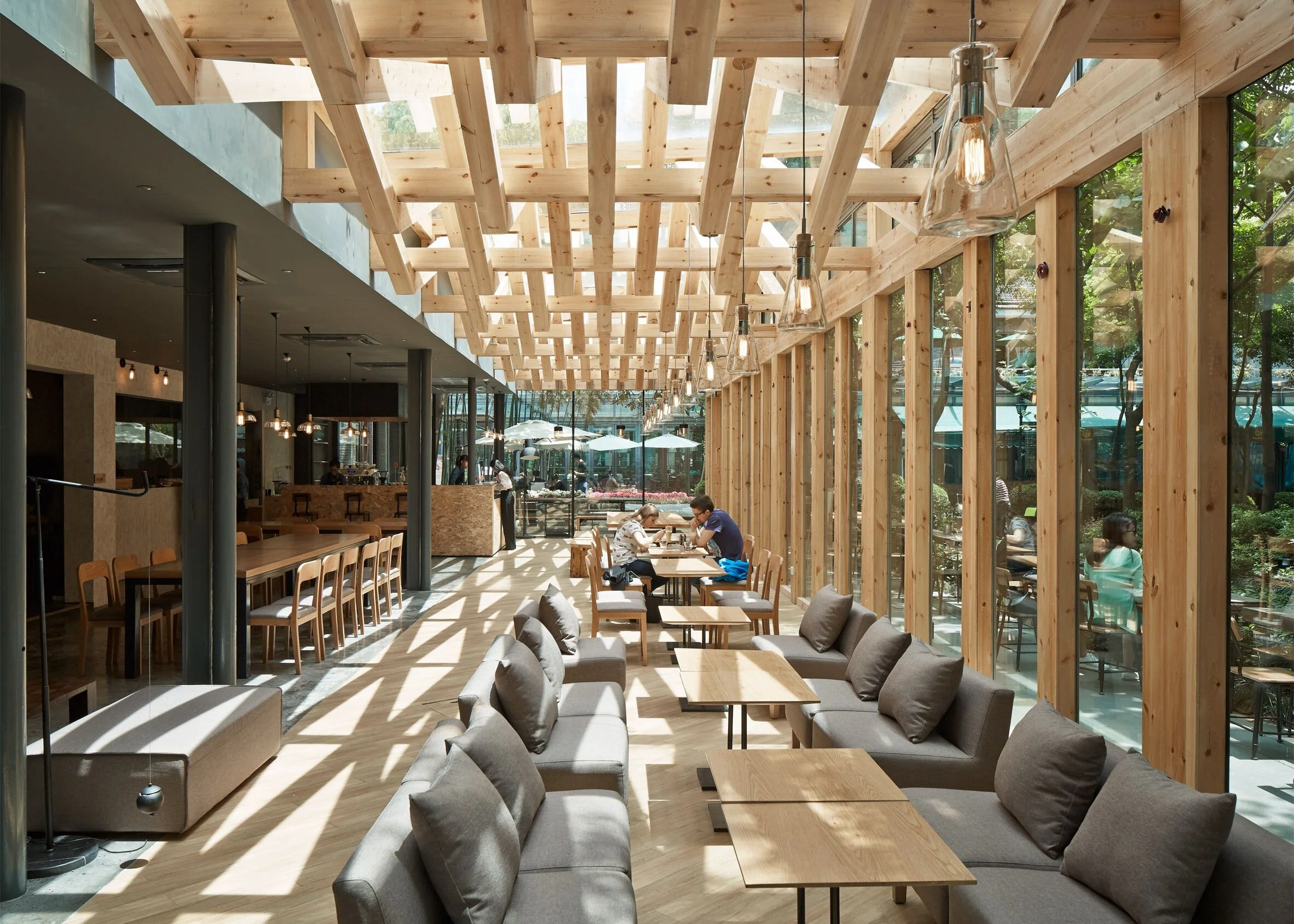
Have you been ignoring your ceilings?
Open ceilings have been on request for a while now, particularly within commercial space. We're still all for it, however just because we're leaving it open, doesn't mean we should ignore it, black it out and consider it complete. A space where only the perimeter surfaces have been dressed, is not a complete design. As designers we need to be conscious of all dimensions and volume within the space. (This premise also leads to why so many designers are working in 3D software instead of 2-dimensional elevations but that's a topic for another day.)
There are so many creative ways to use the ceiling space to enhance your design. It could be as simple as adding colour or as detailed as suspending intricate millwork. And why stop at just the aesthetics? The ceiling is a great place to address acoustics, be inventive with task lighting, or even get creative with required ductwork. Use your ceiling space as a continuation of a wall feature or as a stand alone feature on it’s own.
A fully cohesive design tugs at all the senses while delighting and exciting guests with each new turn. Unlike a 2-dimensional elevation that is viewed singularly, we take in a design experience as a whole. Have fun with the ceiling space. Use it to enhance but also to ground your overall theme. Think of your space as a hollow cube that if rotated in any direction would offer continuous inspiration. Our ceiling spaces should not be forgotten!
Sources Above: from left to right (top row, then bottom row)
Hung Wan restaurant - Shenzhen, China
Ella Dining Room & Bar - Sacramento, CA
Villa de Bear - Bangkok, Thailand
MEC Corporate Office - Sydney, Australia
Product: SoftGrid Switch by Arktura
Easy restaurant - Ascona, Switzerland
Product: Softscape Blades by Armstrong
Xie Xie Cafe - Hangzhou, China


